The Spanish Architects Society in Australia is a platform that aims to encourage an active link between Spanish and Australian architecture and design. It is conceived as a two-way bridge, being a meeting point between Professionals, Academia, Government, and Institutions of both countries. Nowadays, there are many Spanish architects working in Australia or with a strong professional relationship with this country.
A non-for-profit group, the team behind the Spanish Architects Society in Australia has rapidly increased in the last year. Now a larger group of architects and designers interested in this cultural exchange, we´ve challenged ourselves to channel this renewed energy and bring a breath of fresh air and ideas to the table.

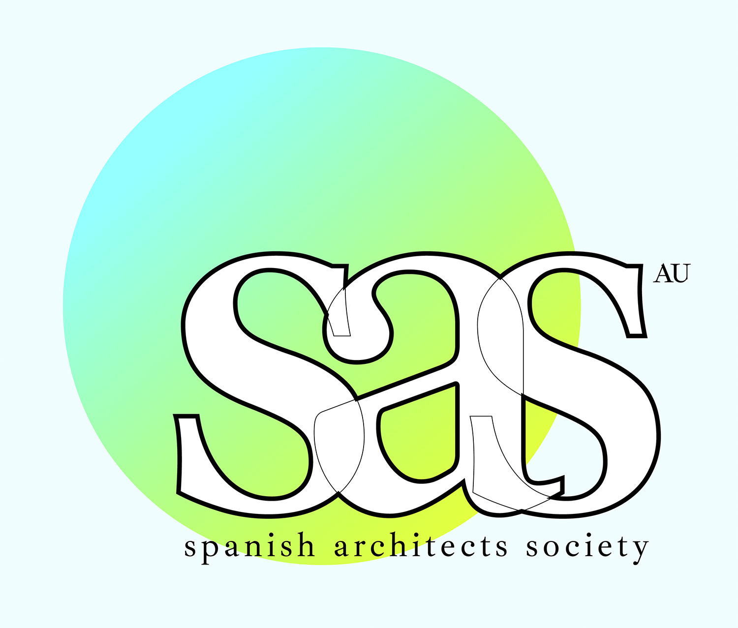
The first of many new initiatives we are working on, the new logo aims to signify this significant moment for our team:
With an aim to create a logo that references our cultural wealth, we´ve changed our logo typeface to “Ibarra Real Nova”, created by José María Ribagorda (Initiative) and Octavio Pardo (designer). This typeface is based on the “Ibarra Real”, created by Geronimo Gil for the “Quixote” printed in 1780 by Joaquín Ibarra for the Spanish “Real Academia de la Lengua”. It is considered by many the most beautiful “Quixote” ever edited and the first genuinely Spanish typeface.
Our team, however, has used its design skills to give it a creative architectural twist. By overlaying the three main letters and giving different line thickness to the inner and outer contours, we address the logo as if it was an architectural section. We also aim to make it more contemporary and up to date by using lower cases instead of capital letters.
The Spanish Architects Society in Australia is a platform to expand to more countries, so we have created a logo that can be used by the same society in different countries. The monogram SAS logo is composed of three elements. The abbreviation “sas” in lower case letters; the full name “spanish architects society” below the main part of the logo also in lower cases; and each country of the organization will have the two distinctive letters of the country on the top right part of the logo in capital letters (in this case “AU”).

We understand how critical the flexibility of a logo is in a web context, and we have adapted to it by proposing three different logos with a very clear purpose.
We have two versions of our logo (white and black) that can be used in a light or dark background respectively, regardless of the background being a plain color or image. The contrast between the outer lines and the background color will always give a good visual contrast to recognise the logo. These two are the official versions that should always be used for sponsorships or official branding images.

We added an extra version that can be usefully be used in special events or media post to reinforce the topics that are being discussed. Eg: when giving visibility to a certain building or material this special logo will incorporate the image at its background.
Client
Spanish Architects Society
Date
2020
Location
Melbourne, Australia
Status
Finished
Author
SAS Visual Content team
Design Team
Javier López-Menchero, Olalla Monteagudo, Noelia Almeira


